Daylily Records: Vinyl Record Packaging
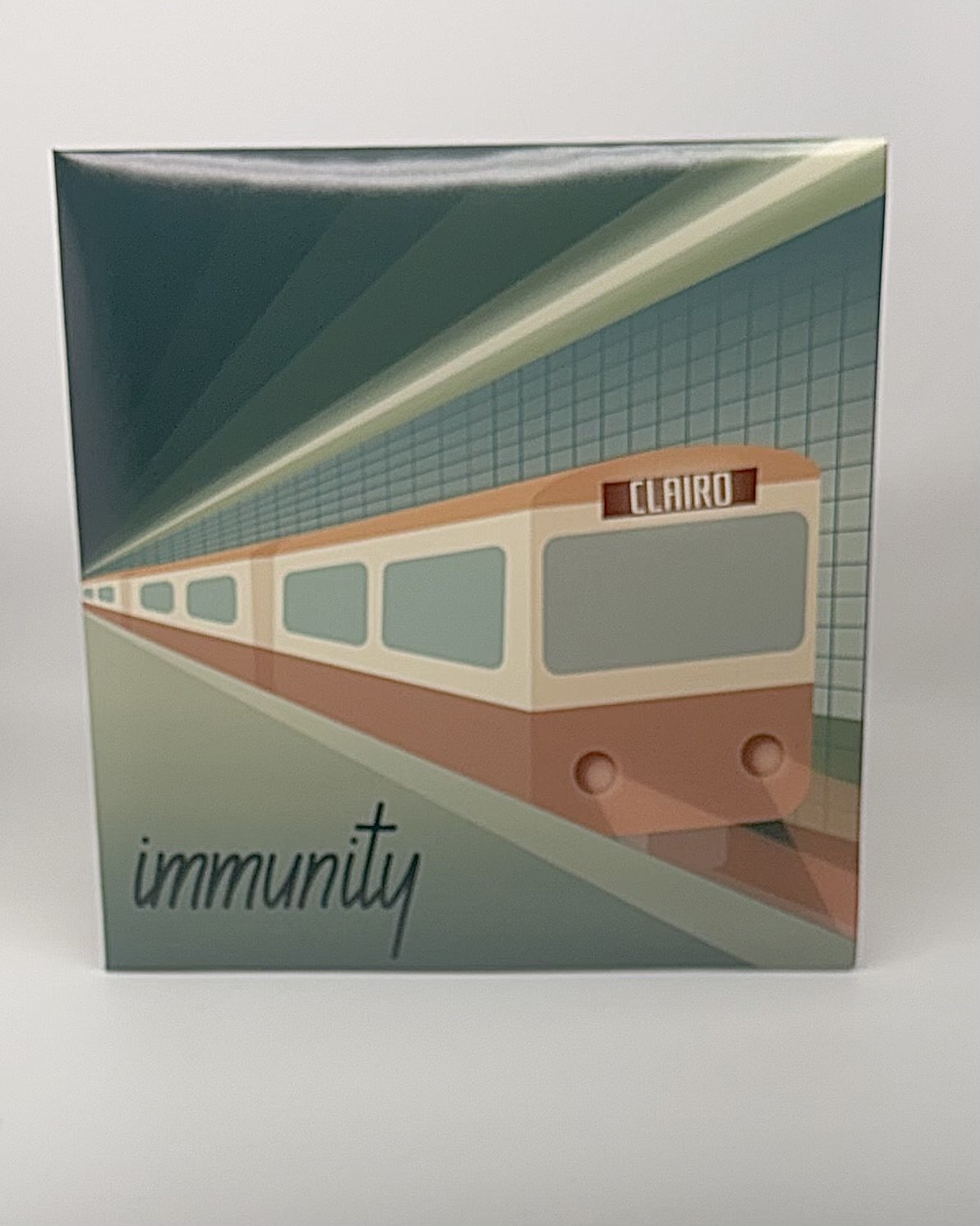
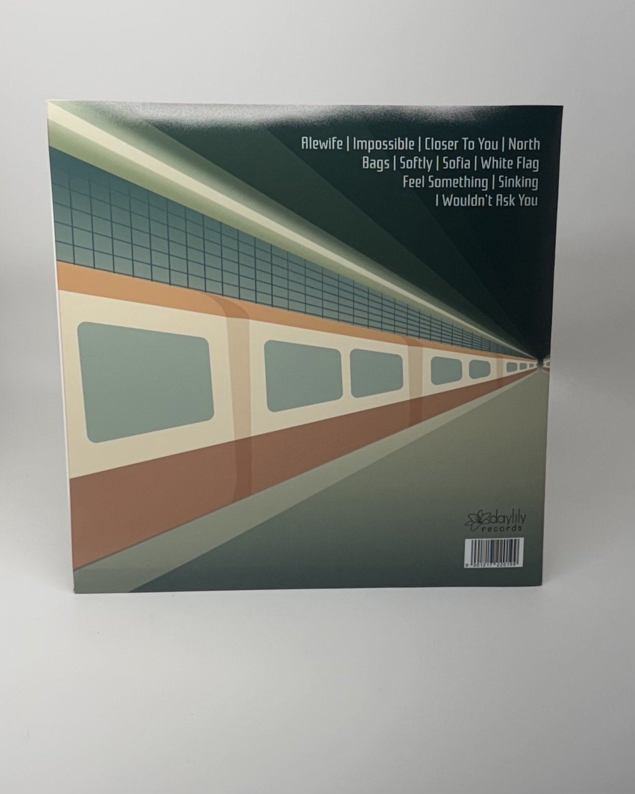
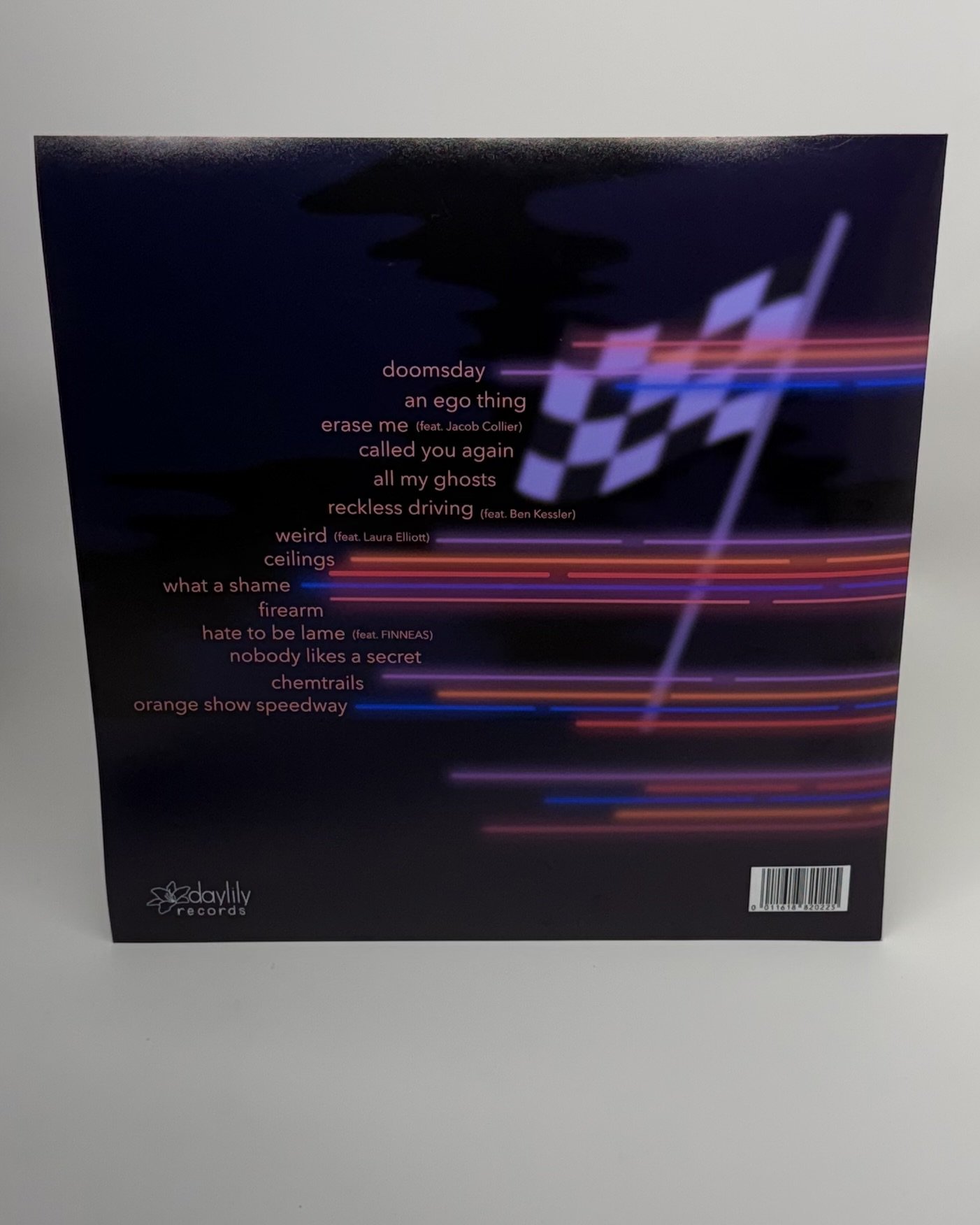
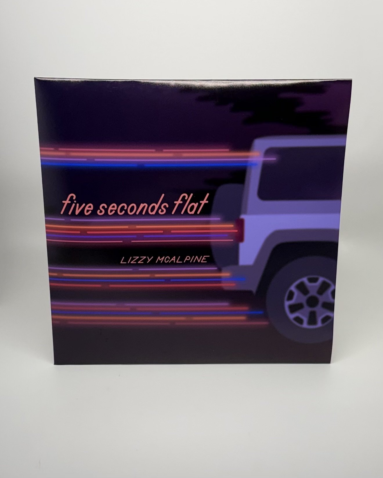
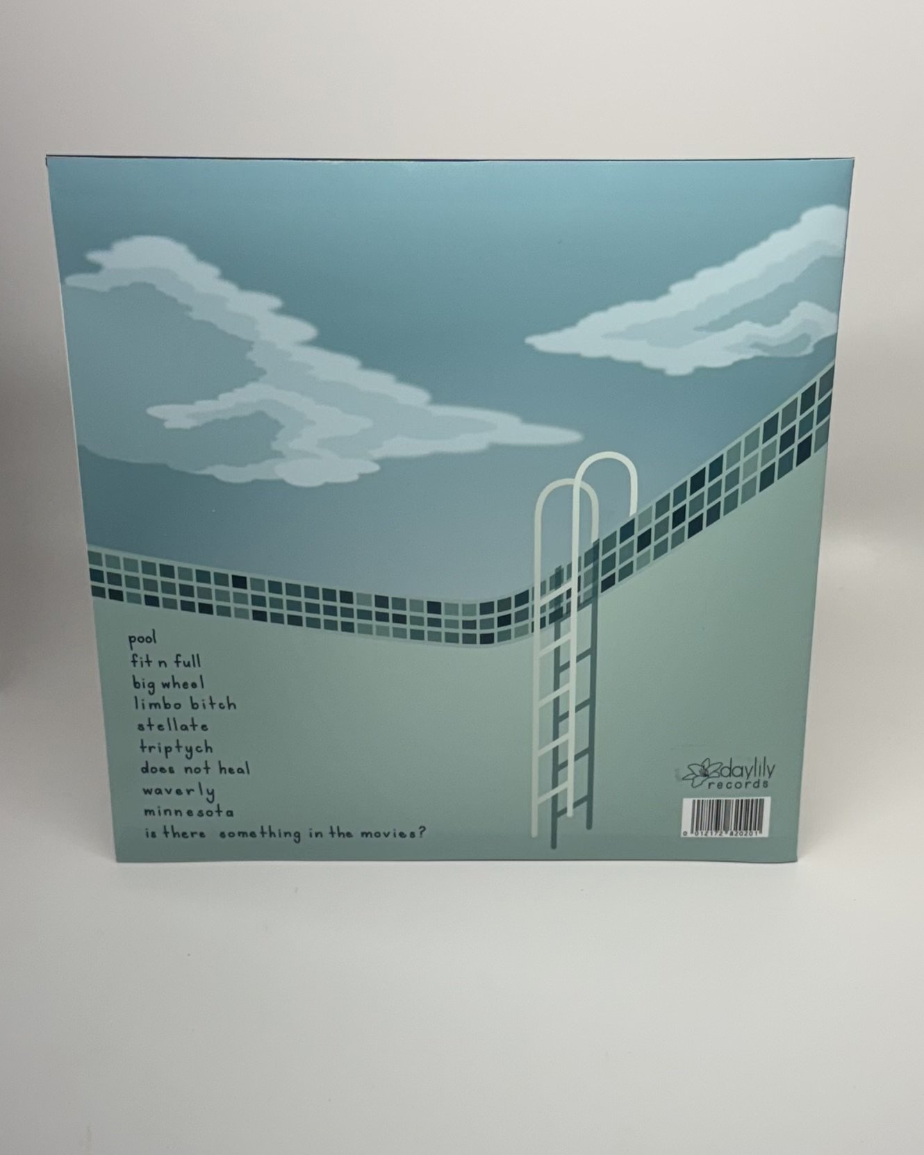
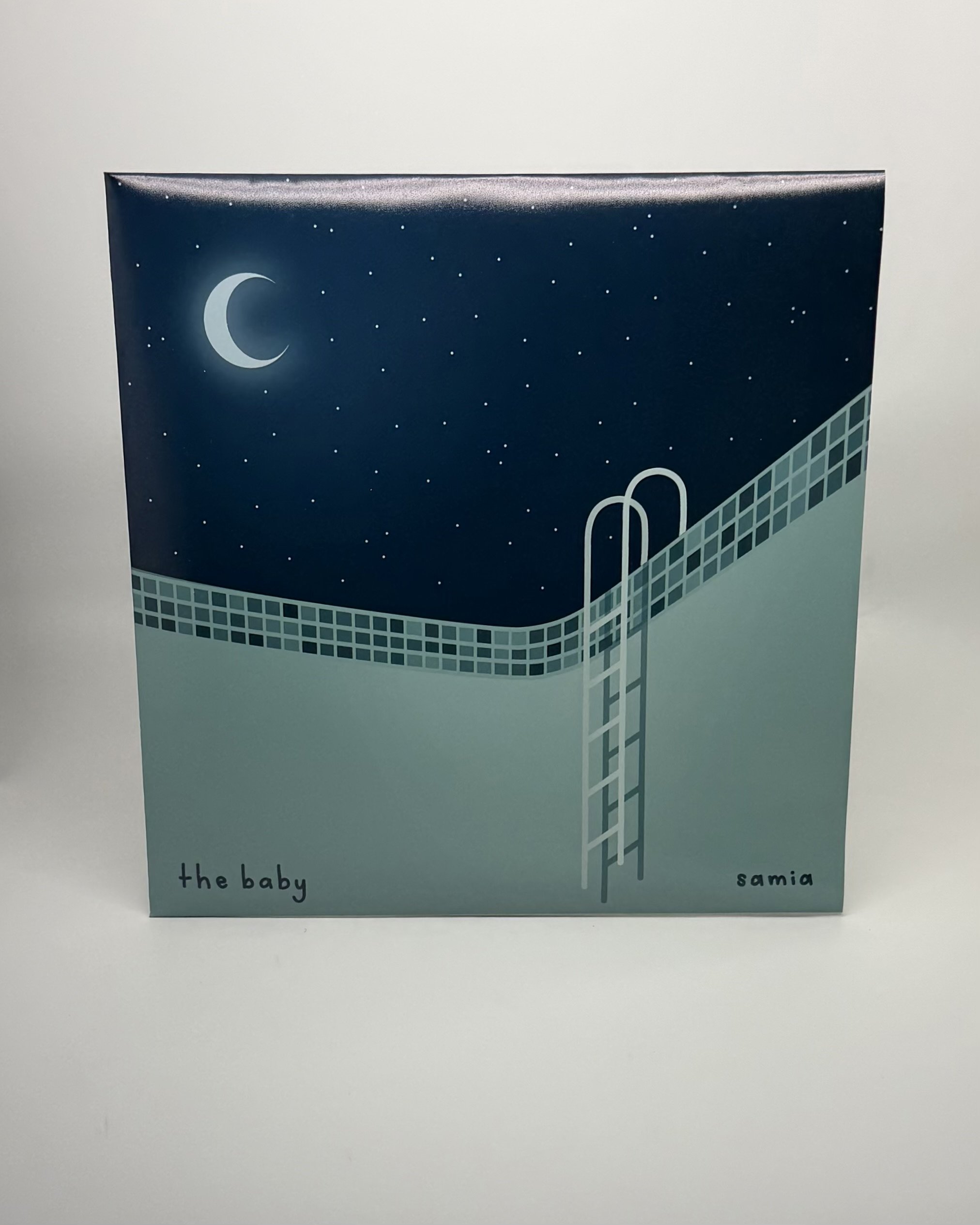
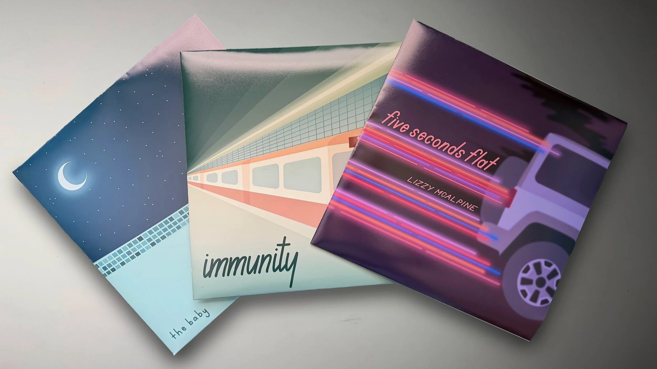
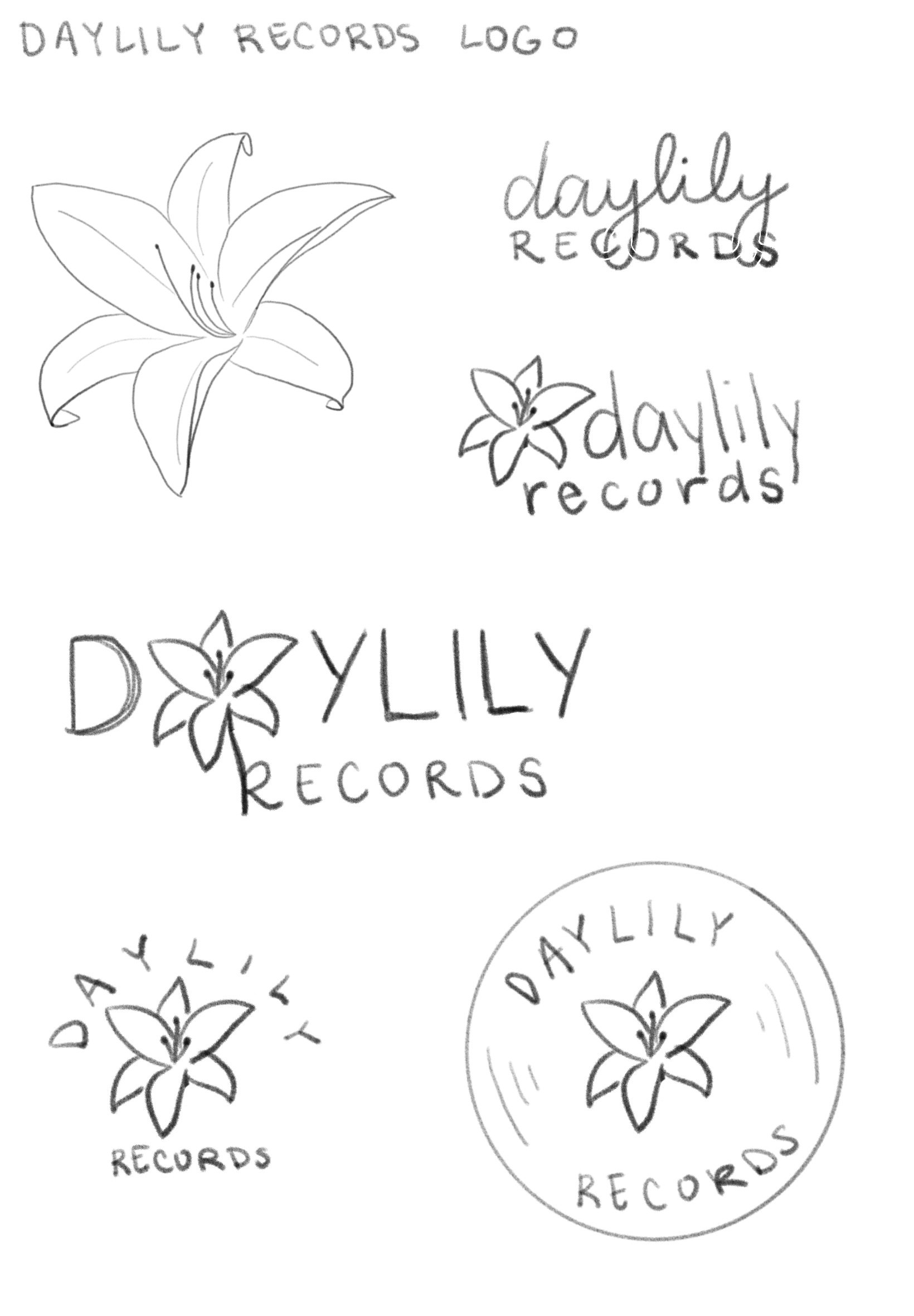
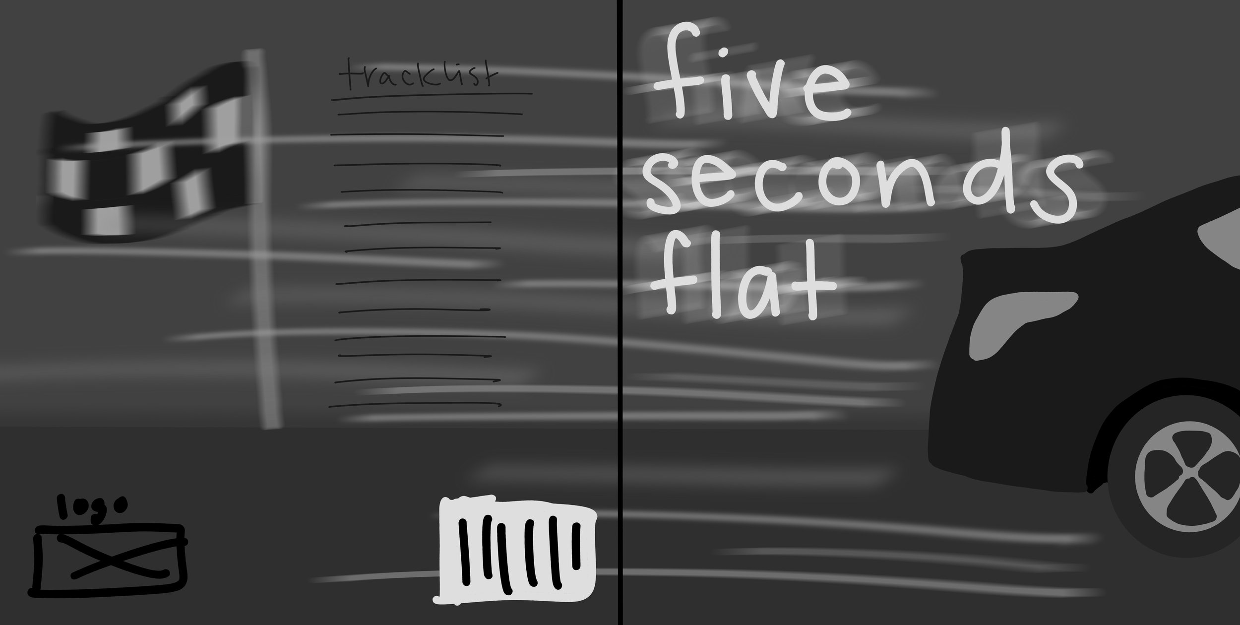
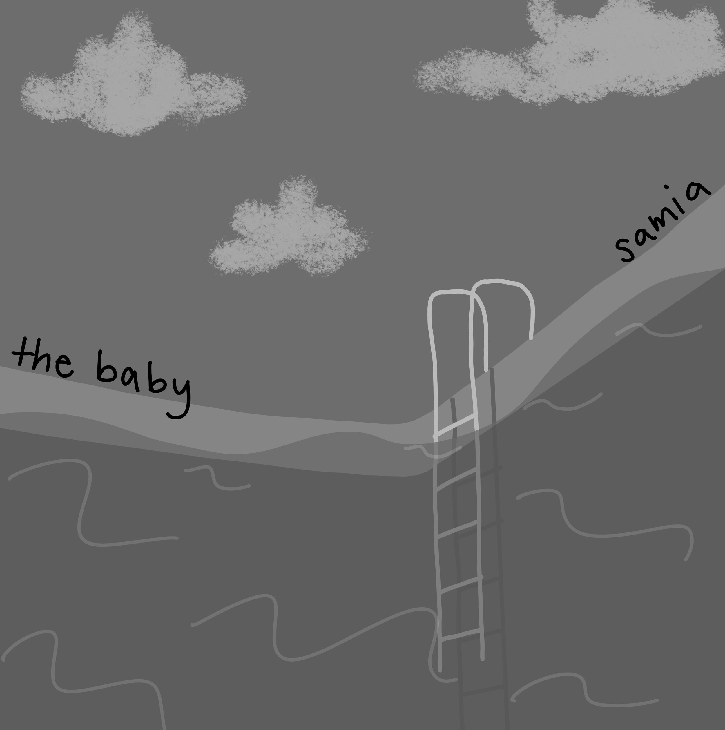
Daylily Records, a hypothetical record label that works primarily with female artists who make alternative music, wanted a new logo and illustrated vinyl record sleeves for three artists that would be under their label. After deciding which artists and albums would fit within the record label, my goal was to design a logo that represented the company and would be applicable to any style as well as illustrate front and back album covers formatted for a 12 inch vinyl record dieline.

Concept:
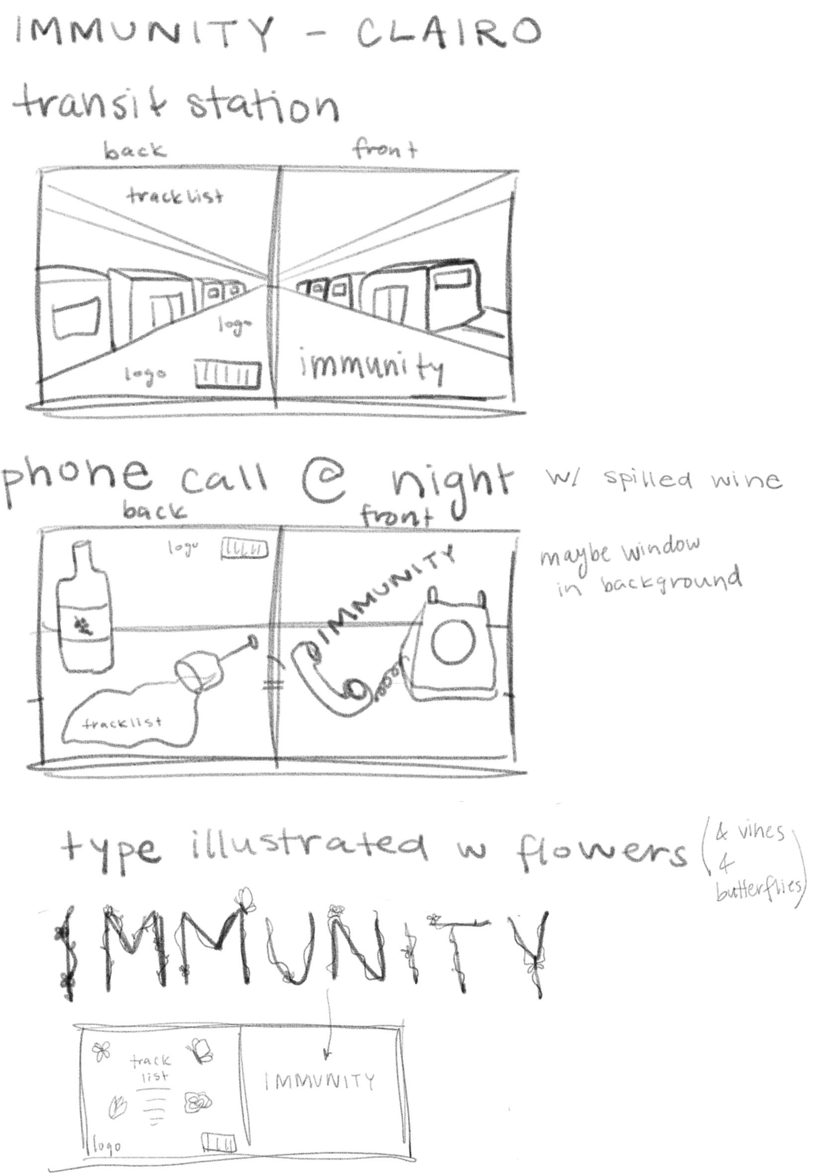
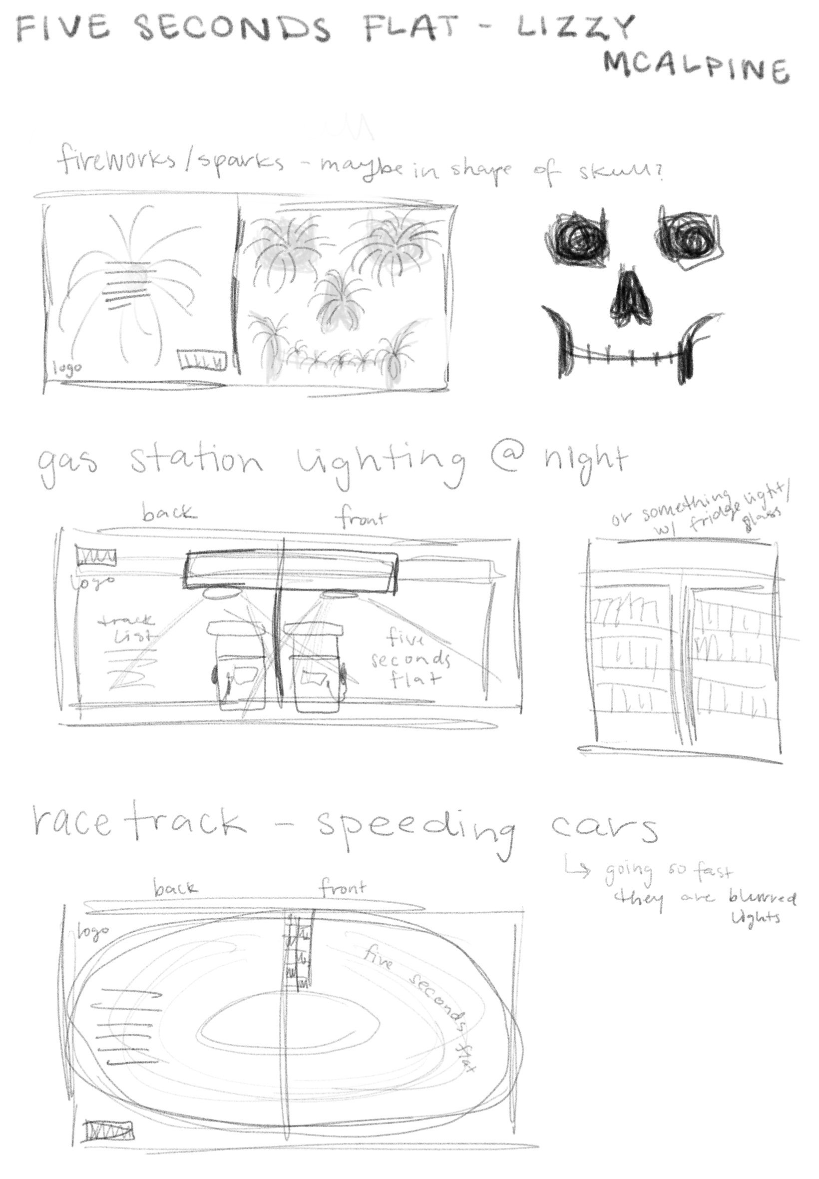
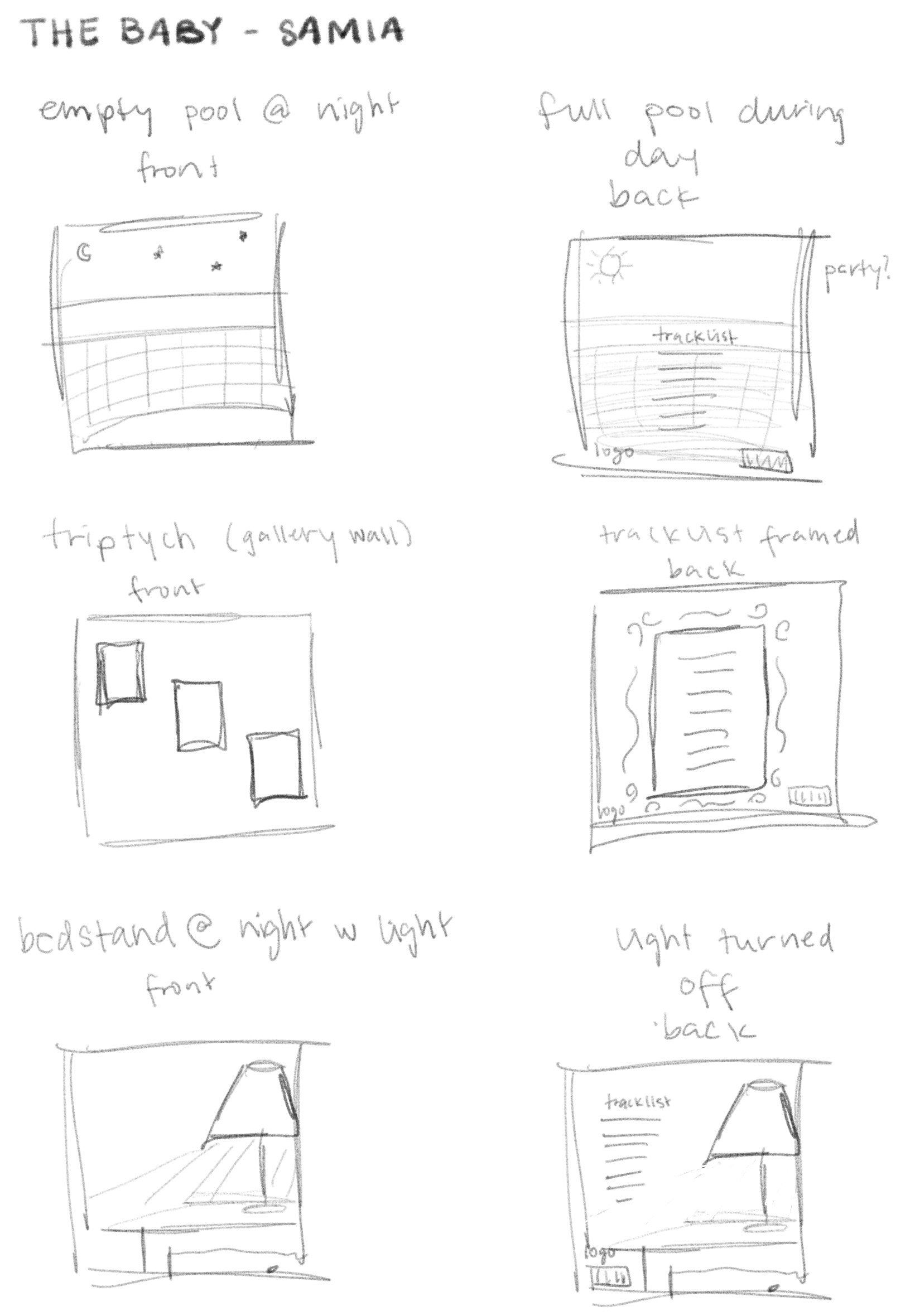
To start, I went through the songs on each album making note of the literal and metaphorical motifs and themes and then sketched several concepts based upon the ideas that either occurred often or stood out to me. From these concepts, I chose the designs that felt the most successful at capturing the feeling of each album while also subtly including key ideas and motifs to further develop.

Feedback:
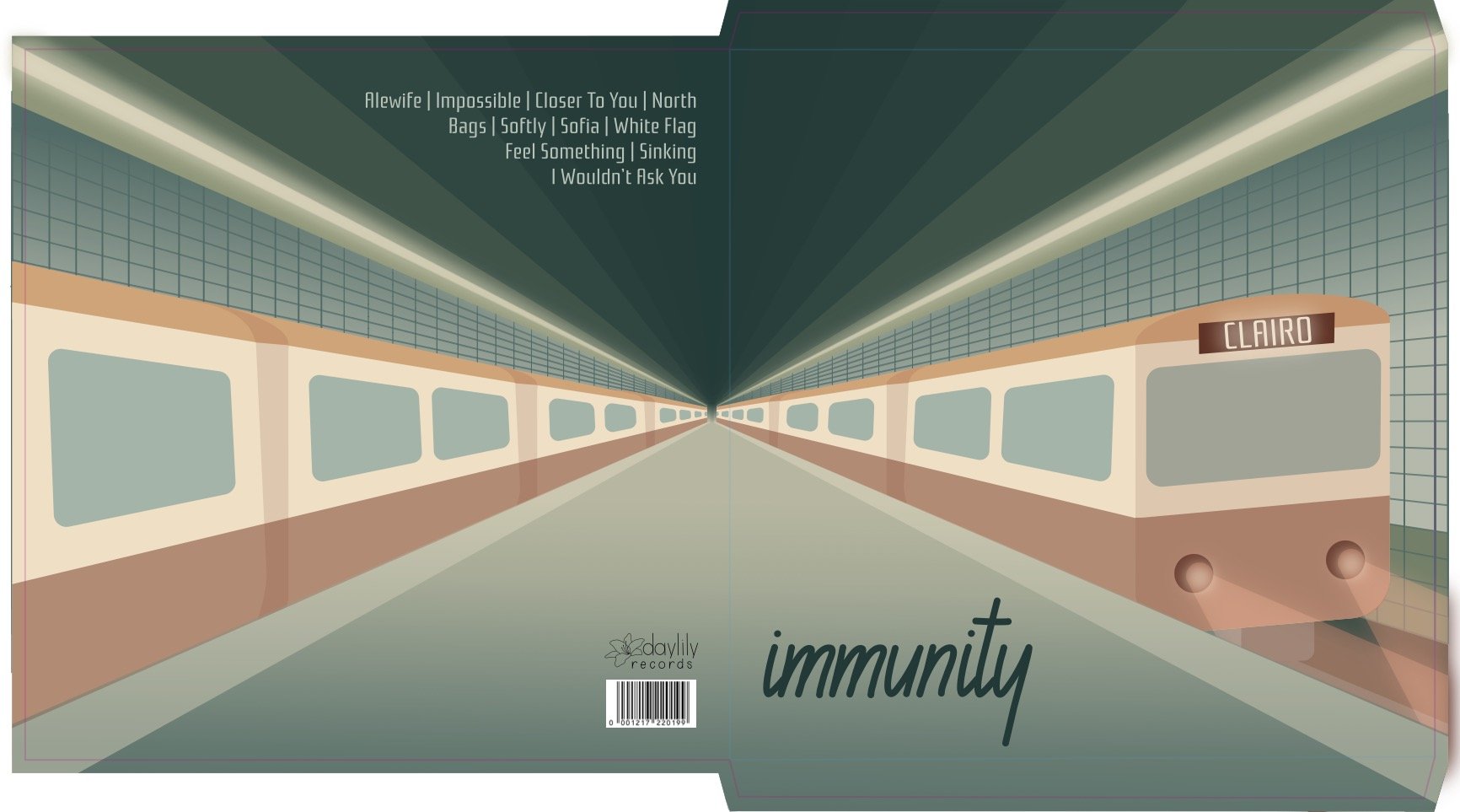
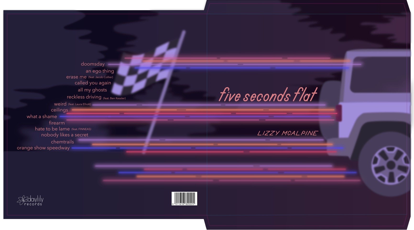
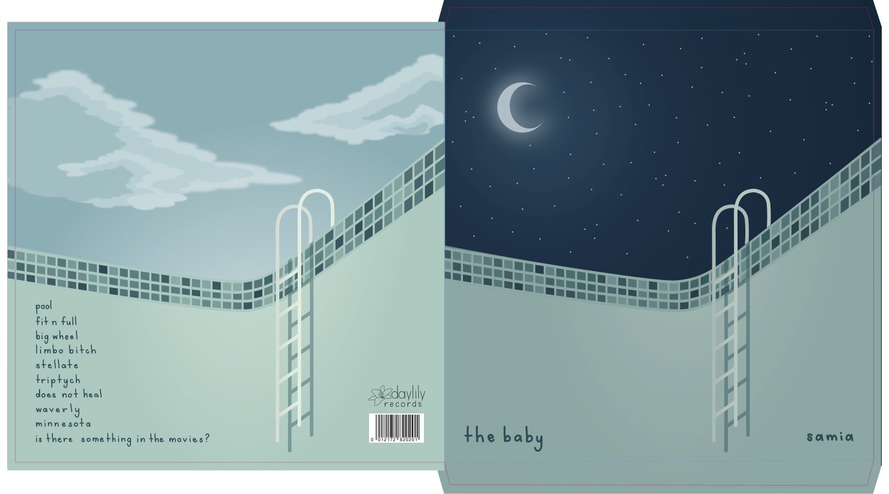
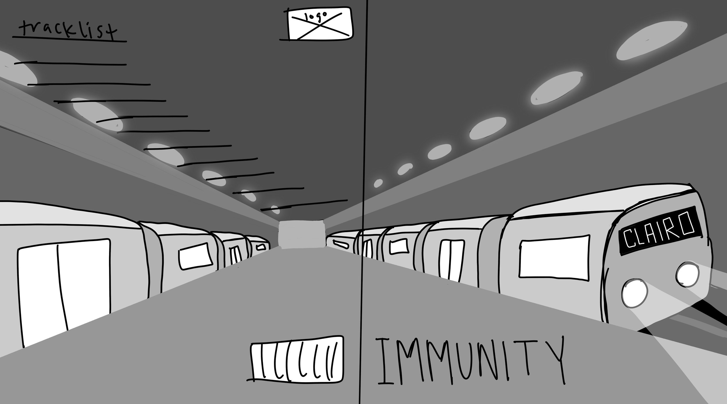
The biggest pieces of feedback that I received on my initial designs were regarding clarity and unity. The subway station design for Immunity read unintentionally as liminal and creepy, the water for the cover of The Baby seemed warped, and there was something missing across all three designs to create a sense of cohesiveness within the set. To remedy the issues with how the designs were being perceived, I further rendered each album cover and removed elements that felt unnecessary. To create cohesion, I added a source of illumination in each design and then used a variation of my handwriting for the album name text.



Outcome:
The logo I created and the vinyl packaging art that I designed established an identity and style for Daylily Records and the artists that would hypothetically be represented by them. By solely producing illustrated album art, Daylily Records distinguishes itself as a company that supports all forms of arts which serves as a unique draw to consumers.