Typography Posters
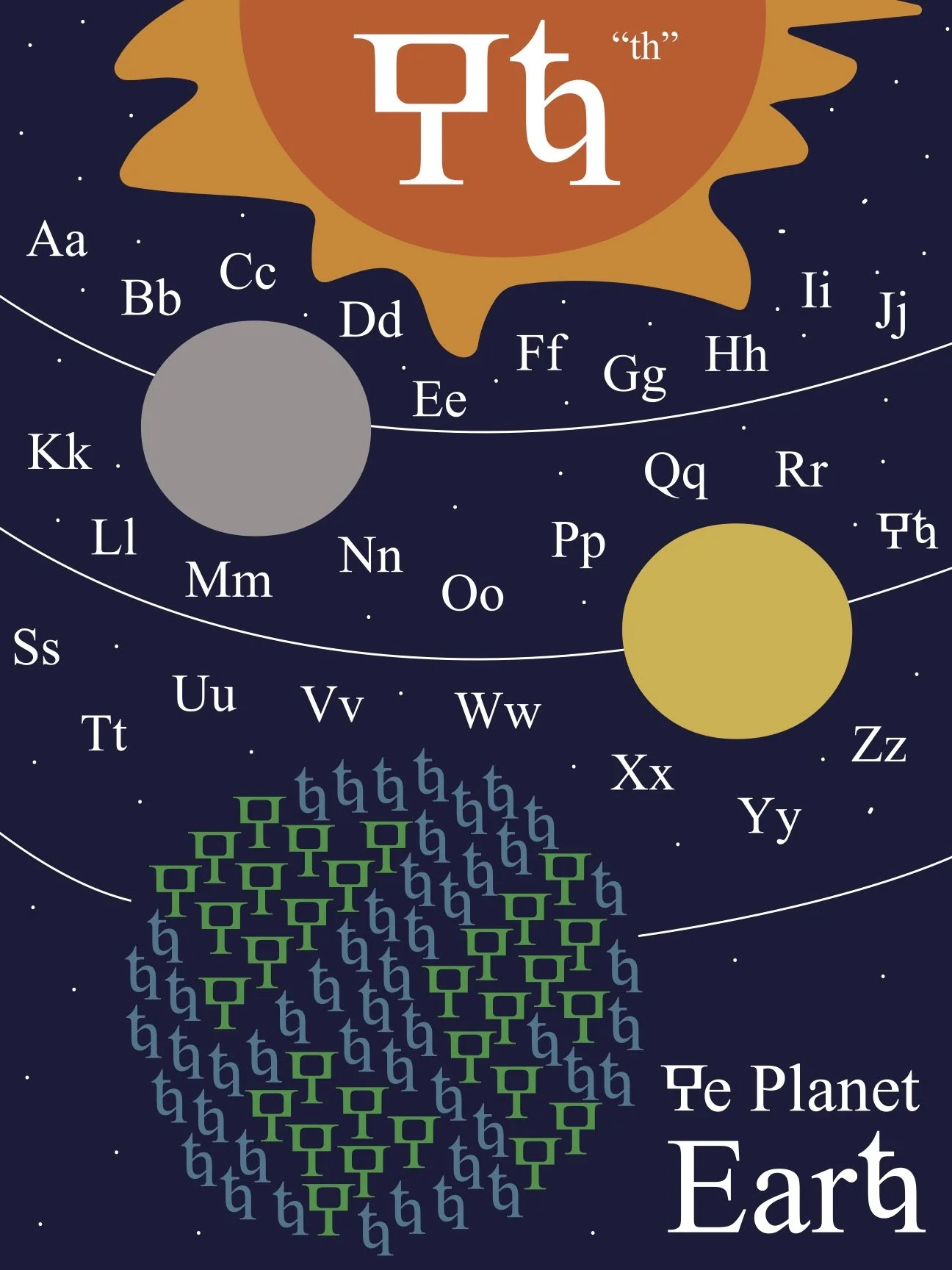
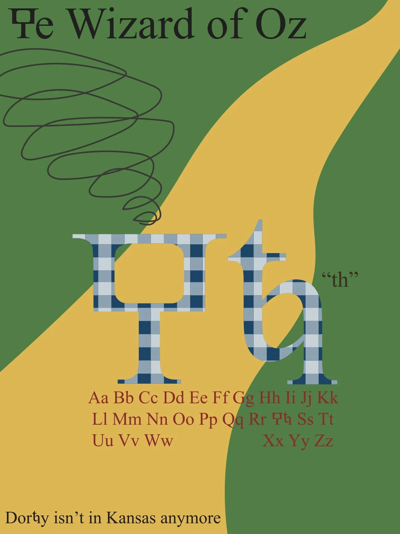
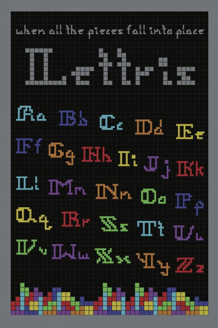
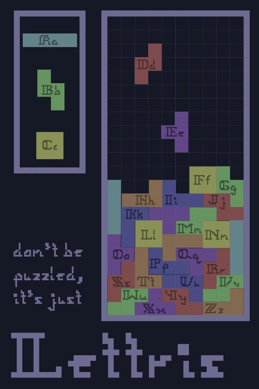
In conjunction with each project for my typography class, we were tasked with creating a poster to advertise the character/typeface that we created in a unique way.
The first poster needed to advertise the newest character addition to the alphabet that I had created and the second was meant to promote the typeface I designed.
Concepts:
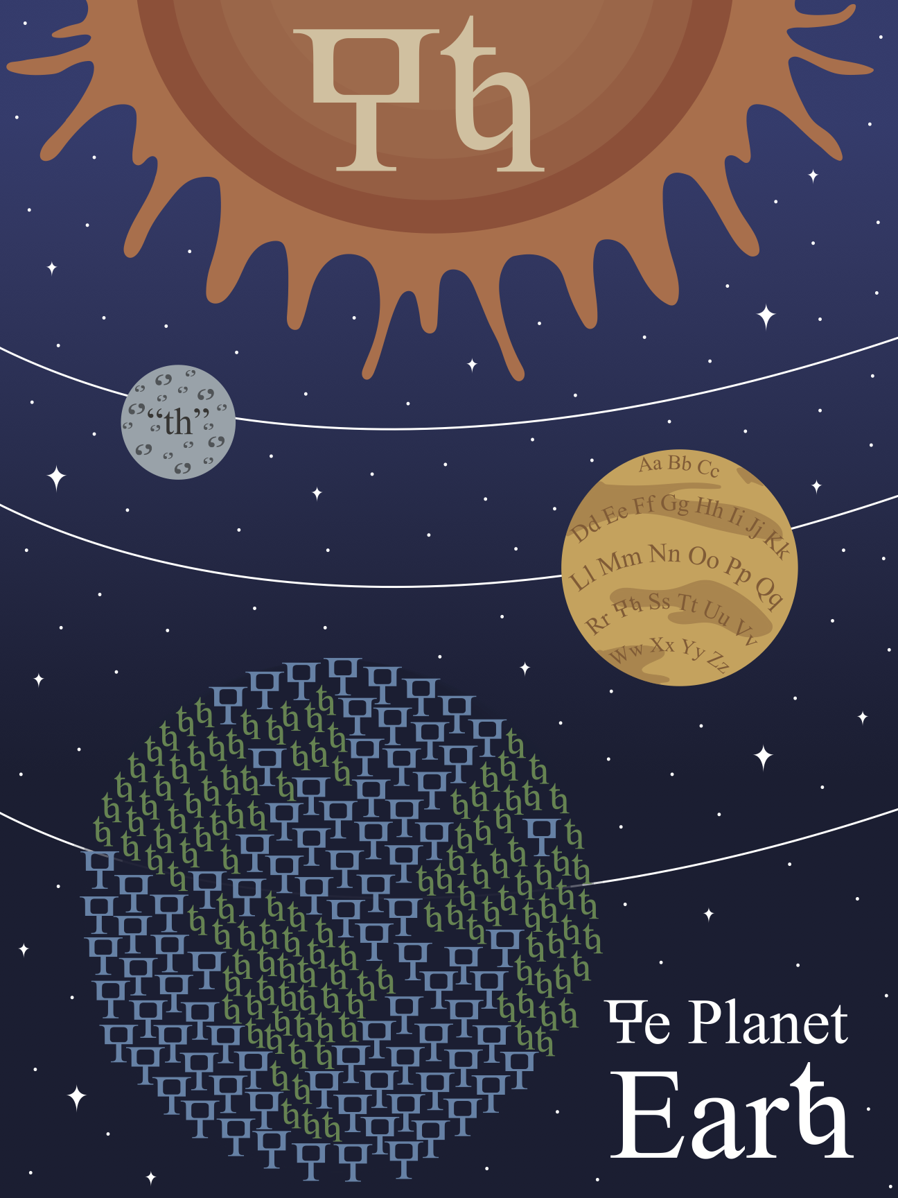
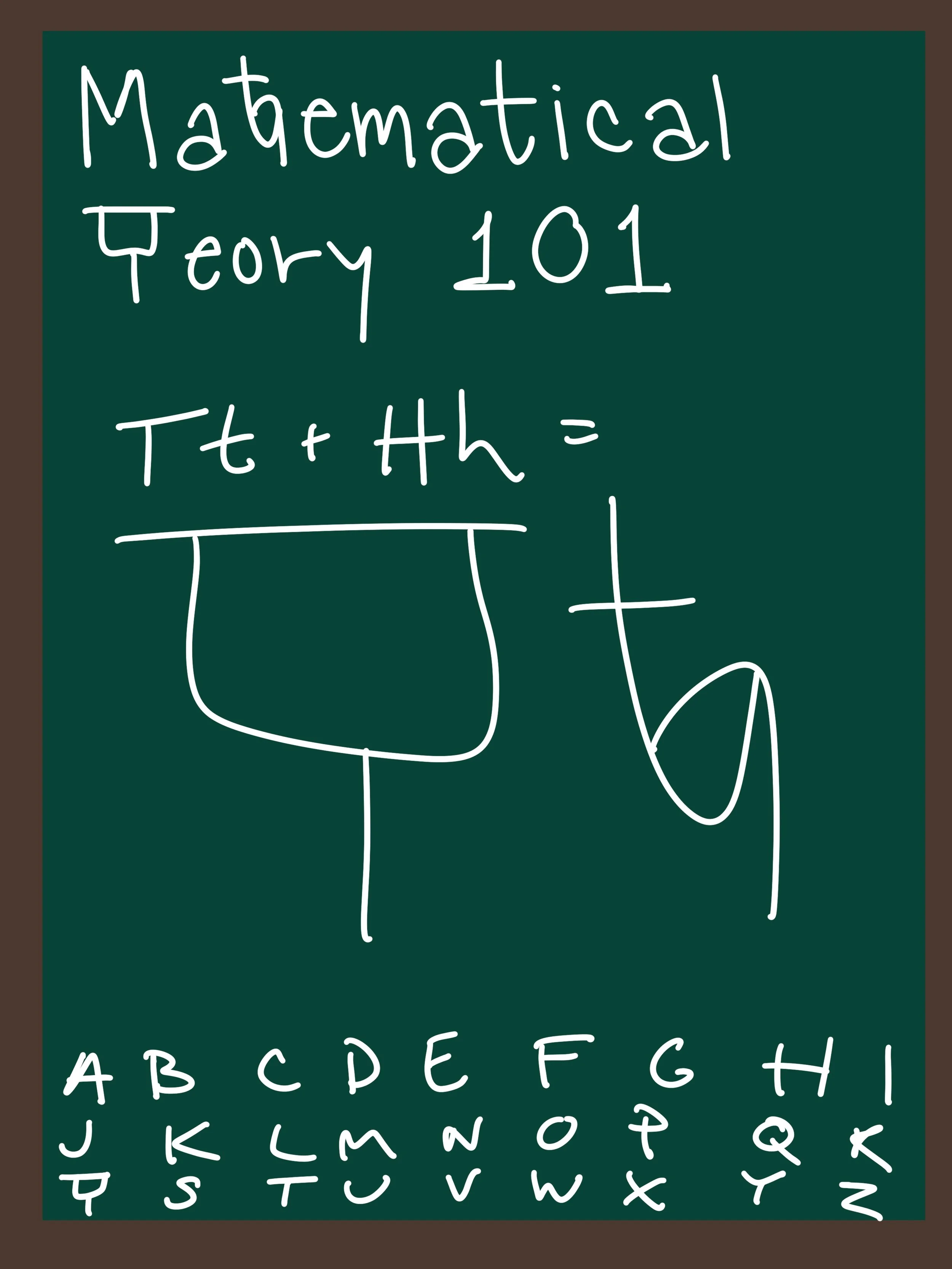
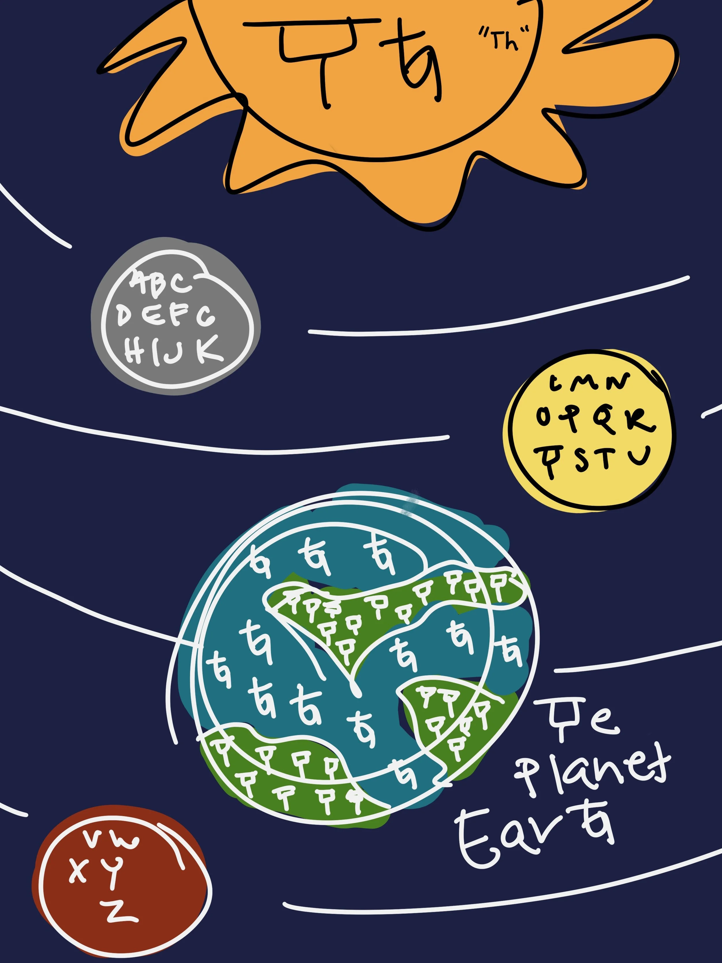
Because the character I designed was for the “th” sound, I started sketching ideas for any word or name that contained that sound and was associated with visually intriguing imagery. After working on all concepts, I chose to further develop the solar system idea, which was a more unique concept that was not overly complicated.
Concepts:
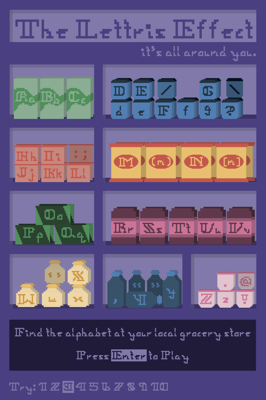
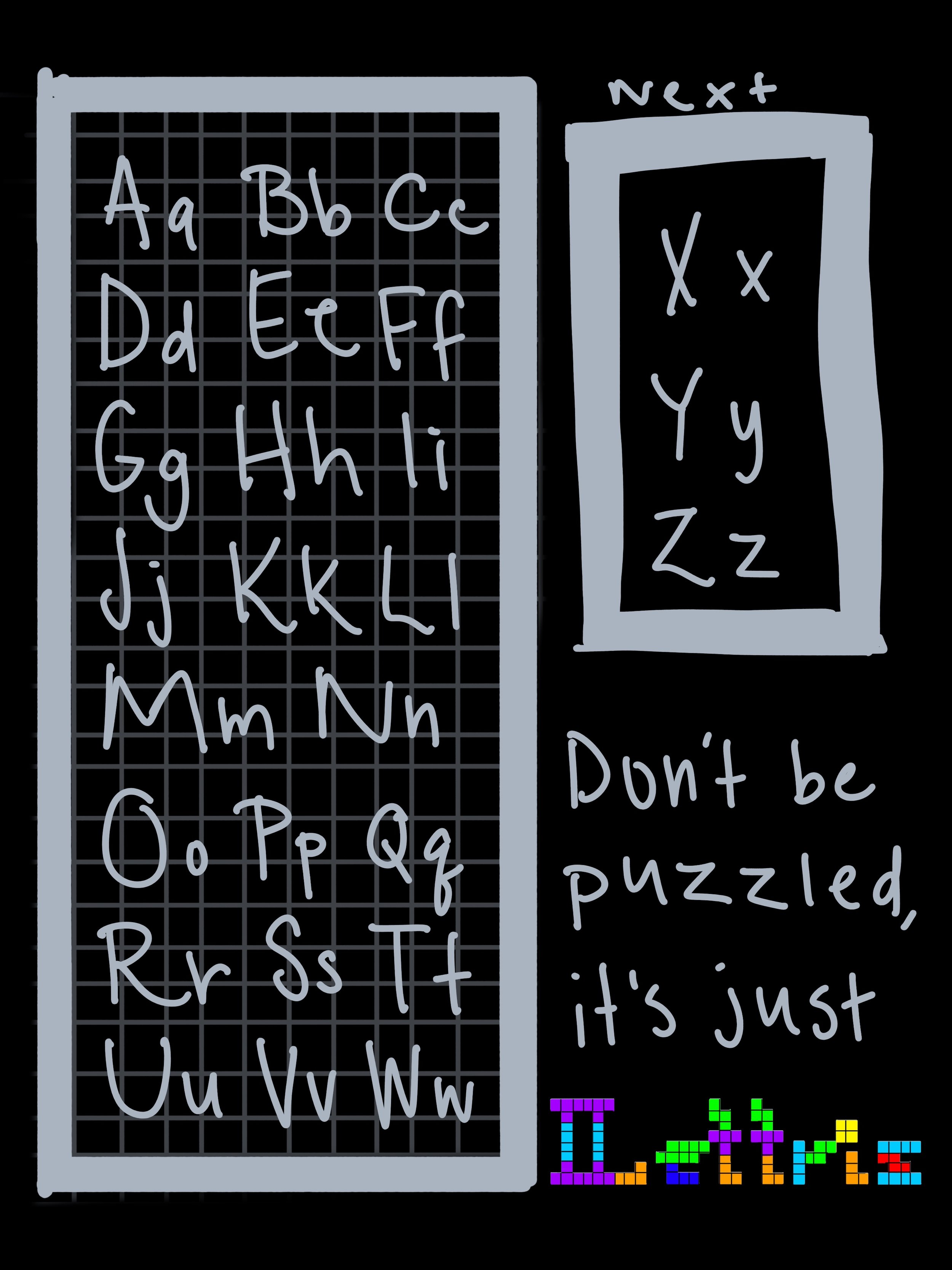
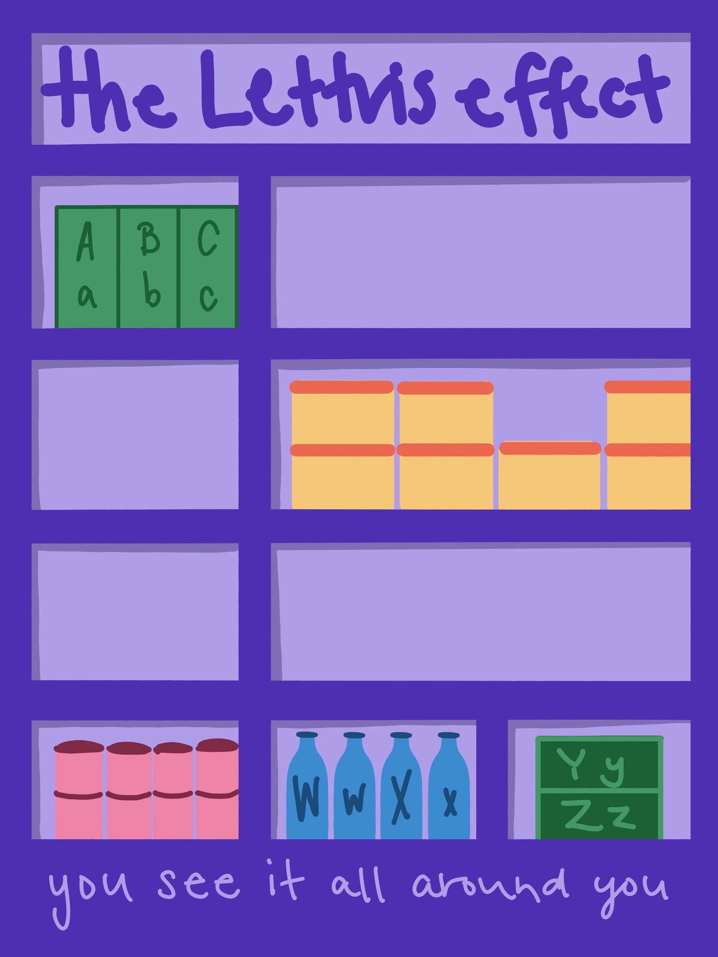
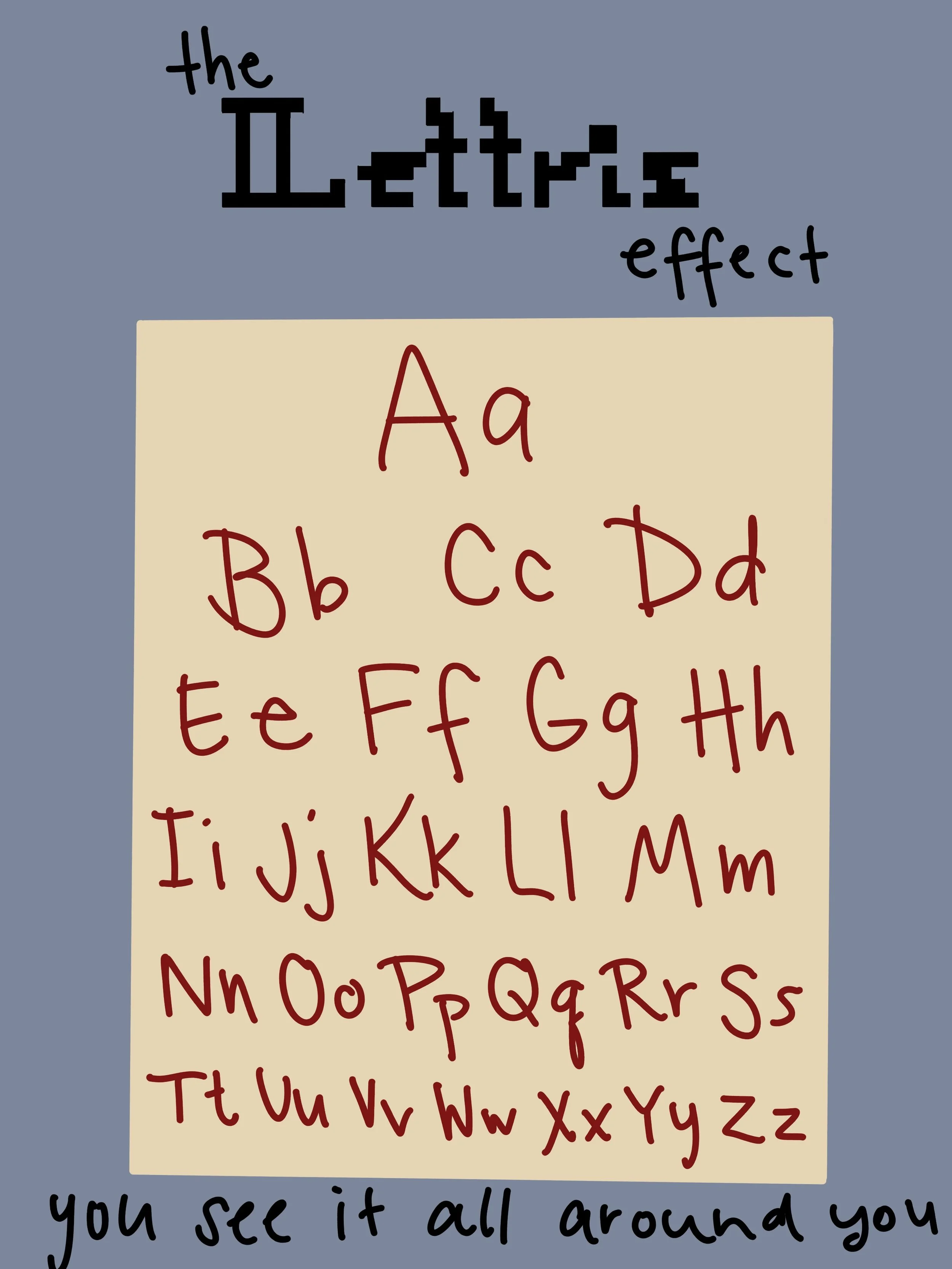
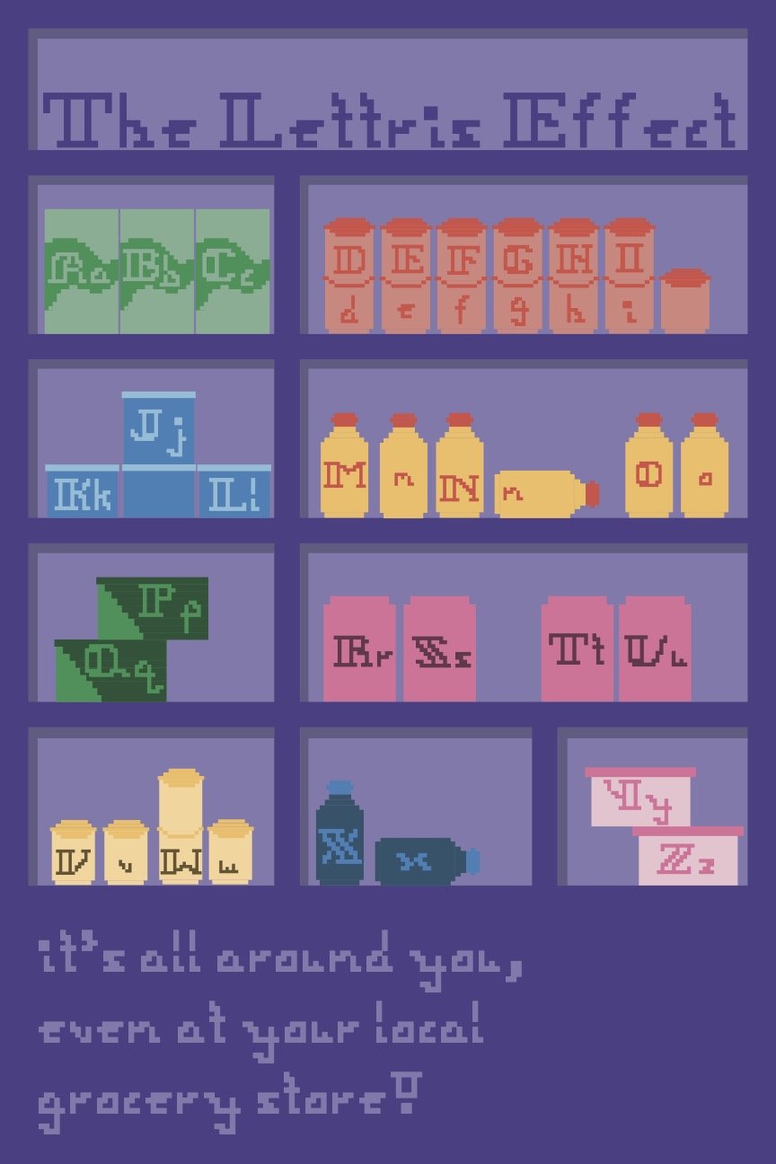
As for my typeface, “Lettris,” because it was built entirely from Tetris pieces, the game was my main source of inspiration. Ultimately, though, I felt like pulling from the idea that the puzzle-like nature of Tetris can be found anywhere was a more interesting concept.
Feedback:
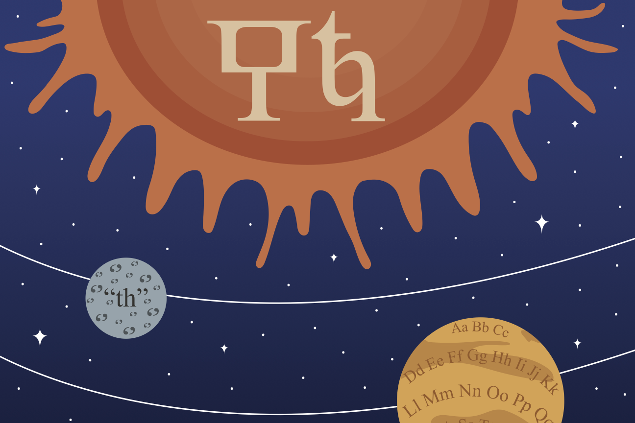
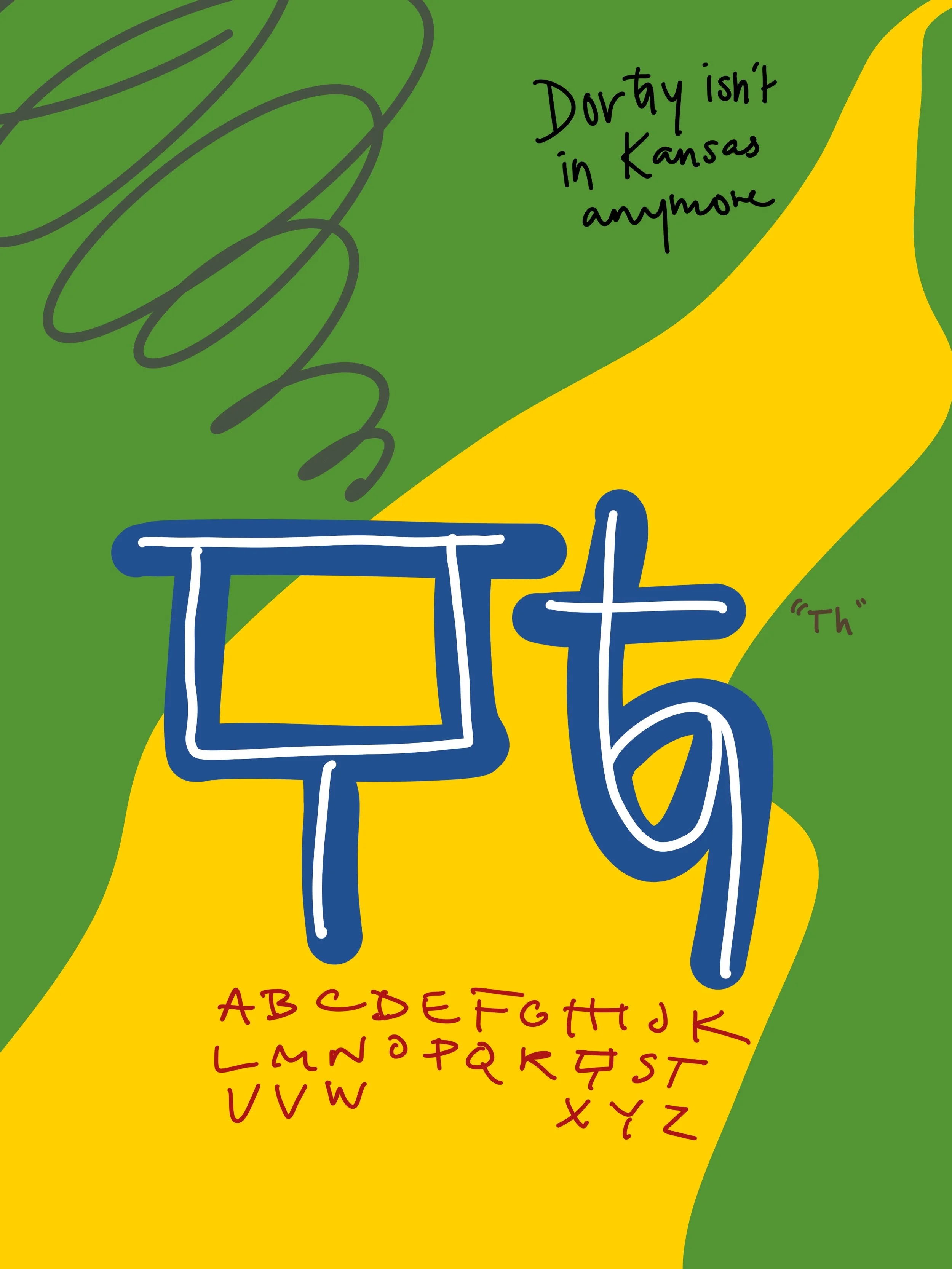
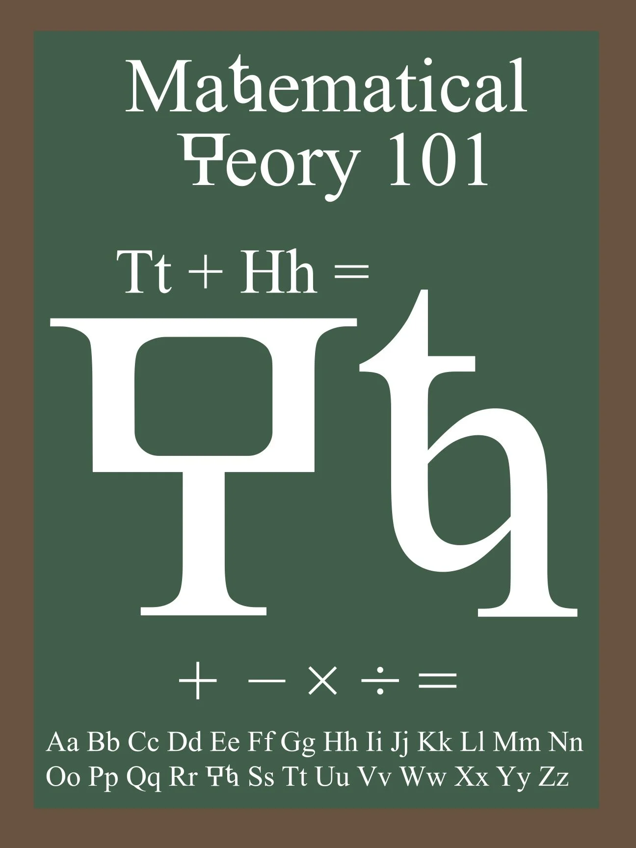
Overall, the concept for my new letter poster was well-received and thought to be interesting, but the actual details of it fell a bit flat. With this feedback, I focused my attention on fully rendering each aspect of the poster.
Feedback:
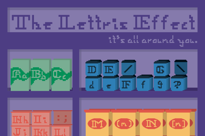
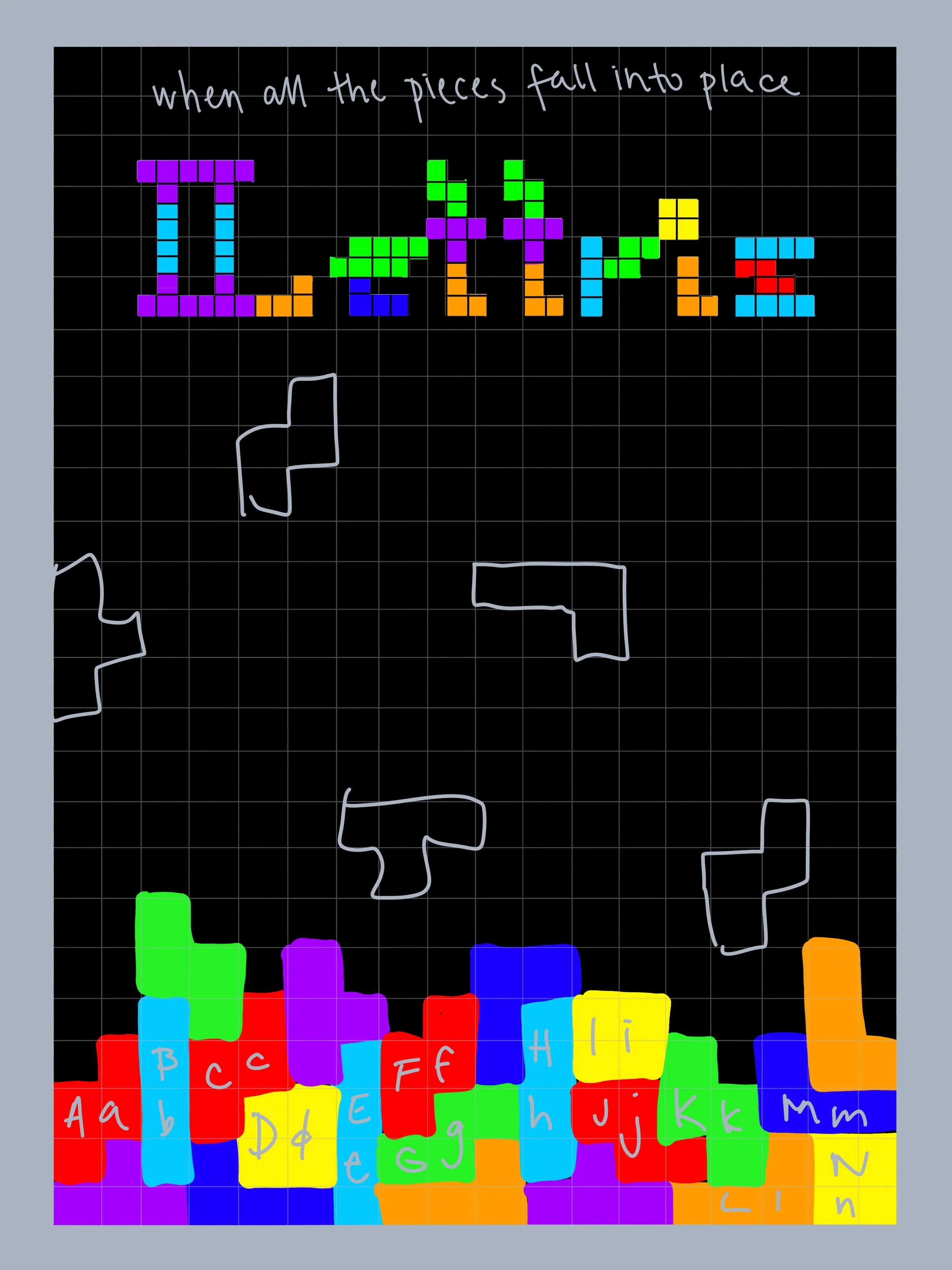
The feedback that I received for my “Lettris” poster was that it was a fun and unique concept, but it strayed too far from the game itself so it lacked a point of connection. From this, I decided to incorporate a video game concept into my design, which also added a layer of audience interaction.
Outcome:
Both posters displayed as well as advertised their respective piece of typography in a unique and eyecatching way. My new letter poster highlighted the character while incorporating other details that allowed audiences to understand its sound and place within the alphabet. My typeface poster exhibited each character created within a context that drew audiences in to see where and when the typeface would be useful.